
Technical Analysis — Zero to Hero · Part 1 of 22
What technical analysis is, and what it quietly assumes
A different question entirely
Everything on this blog so far has asked one question: what is this business worth? Read the statements, compute the ratios, forecast the cash flows, discount them back. The capstone closed that arc.
Technical analysis (TA) asks something else: what is this price doing? It studies the record of what buyers and sellers actually did — price and volume — and largely ignores what the company sells, what it earns, and who runs it. To a technical analyst, all of that information has already been expressed by people putting money down, and the chart is the record of it.
That’s a genuinely different discipline, not a rival version of the same one. It’s also the part of investing most surrounded by nonsense, so this series is going to be careful about separating what the technique is from what people claim it can do.
The three assumptions underneath everything
Technical analysis rests on three claims, usually traced to Charles Dow’s writing around 1900. Every indicator in this series inherits them, so they’re worth stating plainly and holding onto sceptically.
1. The price discounts everything. Whatever is knowable about a company — earnings, management, industry shifts, and whatever the well-informed know before anyone else — is already reflected in the price. So studying the price is enough.
2. Prices move in trends. A price in motion tends to stay in motion until something changes it. This is the load-bearing assumption: without it, no trend line or moving average means anything.
3. History tends to repeat. Chart formations recur because they’re produced by human behaviour under greed and fear, and human behaviour is fairly stable across decades.
Notice that none of these is a law. They’re empirical claims — they may hold strongly, weakly, or not at all, and they can hold in one market and fail in another. Assumption 1 in particular is a strong form of market efficiency that sits oddly beside the whole enterprise: if the price already reflects everything, it’s not obvious why studying its past shape should help. That tension is real, it’s unresolved, and the limitations post near the end of this series returns to it properly.
🧒 Explain it like I'm 10 (optional — skip if this is already clear)
Imagine you can’t see inside an ice cream shop, but you can see the queue outside, all day, every day.
You can’t read the shop’s accounts. You don’t know what the ice cream costs to make. But you can see the queue getting longer around 4pm, and that it’s always huge on hot Sundays, and that when the queue suddenly triples, a new flavour usually just launched.
Fundamental analysis is asking to see the shop’s books. Technical analysis is studying the queue. The queue really does tell you things — but it will never tell you whether the freezer is about to break down.
What a chart actually is
Strip away the jargon and a price chart is a record of transactions. Each point says: at this moment, a buyer and a seller disagreed about the future enough to trade, and agreed on this price.
Here’s the dataset this entire series uses — daily closing prices for Britannia Industries, the same company the rest of this blog has been analysing:
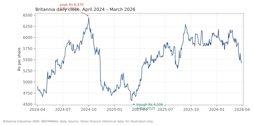
Britannia (NSE: BRITANNIA), closing prices, daily bars, 1 April 2024 to 30 March 2026. Source: Yahoo Finance. Historical data, for illustration only.
Two years, 495 trading days. The stock closed at a peak of ₹6,446.05 on 1 October 2024, then fell 29.0% to a closing low of ₹4,575.2 on 4 March 2025, then spent a year recovering. (Measured from the intraday high to the intraday low, the fall was a little bigger — the next few posts use those extremes.)
A fundamental analyst looks at that and asks what changed about the business. (Something did — the gross margin post covered the input-cost squeeze.) A technical analyst looks at the same picture and asks about the shape: where did the falling stop, how many times was a level tested, is the recovery still intact.
Both are looking at Britannia. They’re not looking at the same thing.
About the data in this series
Every chart in this series is built from one file, and you can download it:
| Company | BRITANNIA.NS (NSE) |
| Period | 1 April 2024 to 30 March 2026 |
| Bars | 495 daily, no gaps |
| Source | Yahoo Finance daily historical OHLCV, BRITANNIA.NS |
| Download | britannia-ohlcv-2024-04-to-2026-03.csv |
Two deliberate choices worth explaining.
It’s real data, and it’s old. The series ends 30 March 2026, more than 6 months before this post publishes. That lag is a rule this blog follows for anything used as a worked example, and it has a useful side effect: nothing here can be read as a comment on where the price is going now.
It’s one stock, over two years. That is nowhere near enough to prove anything about whether an indicator works. When a signal in this series succeeds or fails, that’s an illustration of the mechanism, never evidence about the technique. Anyone claiming an indicator “works” needs thousands of instances across many markets, not one flattering chart — and this series will keep saying so.
Following along in Python
Every calculation in this series is short enough to run yourself. The setup:
import pandas as pd

df = pd.read_csv("britannia-ohlcv-2024-04-to-2026-03.csv",
                 parse_dates=["date"]).set_index("date")
print(df.head())
print(f"{len(df)} bars, {df.index[0].date()} to {df.index[-1].date()}")
Five columns — open, high, low, close, volume — and every indicator in the rest of this series is built from those five numbers and nothing else. That’s worth sitting with. The entire apparatus of technical analysis, all the indicators with impressive names, comes out of five columns of arithmetic.
Where this series is going
| Post | Covers |
|---|---|
| Candlesticks | How a single bar encodes four prices |
| Support and resistance | Price levels that repeatedly matter |
| Trend lines | Drawing, and breaking, a trend |
| Moving averages | Smoothing noise to see direction |
| Volume | The conviction behind a move |
| RSI (relative strength index) | Measuring momentum, and its limits |
| MACD (moving average convergence divergence) | Two averages, and the whipsaw problem |
| Chart patterns | Formations, and the pattern that wasn’t |
| Limitations | The honest reckoning |
| Bollinger Bands and ATR (average true range) | Measuring volatility, not direction |
| Relative strength | The stock against its index |
| Multiple timeframes | Weekly trend, daily signal |
| Backtesting | Testing a rule honestly |
The last four are a second module, added after the first ten. The limitations post isn’t a disclaimer bolted on at the end. Technical analysis has real, well-documented weaknesses — hindsight bias, ambiguity about what counts as a signal, and the awkward fact that many published tests of indicators look much weaker once data snooping and trading costs are accounted for (Park and Irwin’s 2007 survey in the Journal of Economic Surveys is the standard reference). A series that showed you eight indicators and skipped the reckoning would be selling something.
Common mistakes
- Treating TA and fundamental analysis as opponents. They answer different questions. Plenty of people use fundamentals to decide what interests them and charts to think about when — and plenty of people use neither well.
- Believing a pattern predicts the future. At its strongest, a chart describes what has happened and where prices have previously reacted. It assigns no probabilities, and it does not know what’s coming.
- Assuming an indicator works because someone showed you a chart where it did. Any indicator can be made to look brilliant with a well-chosen example. That’s a statement about the example.
- Using TA on something that doesn’t trade much. These techniques assume a liquid market with continuous two-way trading. On a thinly traded small-cap, a “pattern” may be three trades by two people.
- Skipping the question of whether the company is solvent. A chart cannot tell you a company is a fraud, or that its debt is about to be restructured. The ratio toolkit exists for the questions a price series structurally cannot answer.
Takeaway: Technical analysis studies price and volume rather than the business behind them, resting on three assumptions — that price reflects everything, that trends persist, and that behaviour repeats — none of which is a law. Held that way it’s a genuine lens on what buyers and sellers have actually done. Held as prophecy, it’s astrology with better charts.
This post is for educational purposes only and is not investment advice. Wealth Primer explains concepts, not recommendations — nothing here is a suggestion to buy, sell, or hold any specific security or fund. The author is not a SEBI-registered Research Analyst or Investment Adviser. Any prices or figures used as worked examples are historical and shown only to illustrate a calculation. Past performance does not indicate future results. Please do your own research or consult a registered adviser before making investment decisions. See the privacy & disclaimer policy for more.