
Technical Analysis — Zero to Hero · Part 2 of 22
How to read a candlestick chart: open, high, low, close
Why not just a line?
The last post showed Britannia’s price as a simple line — one dot per day, joined up. It’s readable, and it throws away most of the information.
A line chart plots the closing price. But a trading day isn’t one number. The stock opened somewhere, traded up to some highest point, down to some lowest point, and closed somewhere else. A day that opened at ₹5,000, spiked to ₹5,300, collapsed to ₹4,900 and closed at ₹5,010 looks, on a line chart, almost identical to a day that drifted quietly from ₹5,000 to ₹5,010.
Those were not the same day. Candlesticks — developed by Japanese rice traders in the 1700s and popularised in the West by Steve Nison in the 1990s — show all four prices in a single bar.
The anatomy
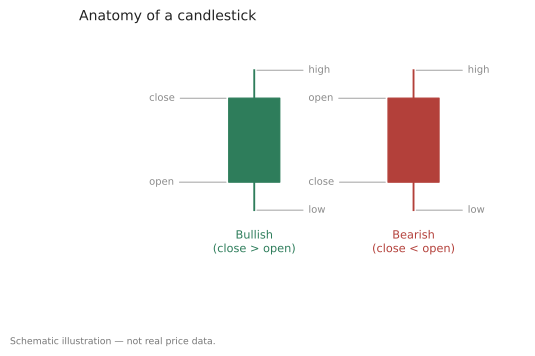
Schematic illustration — not real price data.
Each candle has two parts:
| Part | What it shows |
|---|---|
| Body (the thick rectangle) | The range between the open and the close |
| Wicks (the thin lines, also called shadows) | The extremes — the high above, the low below |
And the colour tells you the direction:
- Green (or white/hollow) — the close was above the open. Buyers ended the session in control.
- Red (or black/filled) — the close was below the open. Sellers did.
That’s the whole notation. A long body means the open and close were far apart — a decisive session. A short body means they finished near each other, whatever happened in between. Long wicks mean the price went somewhere and came back.
🧒 Explain it like I'm 10 (optional — skip if this is already clear)
Think of a tug-of-war that lasts all day.
The body shows where the rope started and where it ended up. If it ended up on the buyers’ side, the candle is green. If the sellers dragged it their way, it’s red.
The wicks show how far the rope got pulled at the furthest moments, before being hauled back. A really long wick upward means the buyers got the rope almost all the way over — and then lost it again before the whistle.
A line chart only tells you where the rope finished. Candles tell you how hard the fight was.
Reading real candles
Here’s Britannia through the turn of 2026 — two months of real trading days:
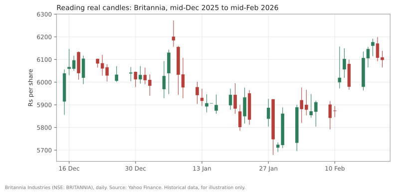
Britannia (NSE: BRITANNIA), daily, mid-December 2025 to mid-February 2026. Source: Yahoo Finance. Historical data, for illustration only.
Some things you can read straight off it that a line chart would have hidden:
- Long upper wicks near the highs. Several sessions in early January pushed up and closed well below where they’d reached. Buyers got the price up there; it didn’t stay.
- Alternating colours in the middle. Long stretches of green-red-green-red with small bodies — sessions that opened and closed near each other. That’s a market with no settled view.
- The occasional long body. A few sessions ran decisively one way. Those are days when something happened.
The single-candle shapes worth knowing
A handful of individual candles have names. They describe the shape, and the usual interpretation attached to each is much softer than most sources admit.
| Shape | Looks like | Usual reading |
|---|---|---|
| Doji | Almost no body — open ≈ close | Indecision; neither side won |
| Hammer | Small body at the top, long lower wick | Sellers pushed down, buyers pulled it back |
| Shooting star | Small body at the bottom, long upper wick | Buyers pushed up, sellers pulled it back |
| Marubozu | Long body, almost no wicks | One-sided conviction all session |
And two-candle combinations:
| Shape | Looks like | Usual reading |
|---|---|---|
| Bullish engulfing | A green body that fully covers the previous red body | Buyers decisively overturned yesterday |
| Bearish engulfing | A red body that fully covers the previous green body | Sellers decisively overturned yesterday |
Now the honest part. These shapes describe what happened. The predictive claims attached to them — “a hammer signals a reversal” — are much weaker than their confident names suggest. Hammers appear constantly in the middle of trends that carry straight on. In this dataset you can find hammers followed by rallies and hammers followed by further falls, and the candle looked identical both times.
Treat a named candle as a description of one session’s tug-of-war, not a forecast. That’s the level of claim the shape can actually support.
The dataset makes the point concretely. Applying a standard hammer definition to these 495 bars finds 25 of them. Ten trading days later, 15 had risen and 10 had fallen, with a median move of about +1%. That is close to a coin flip on a small sample — not a signal, and not a refutation either. It’s simply what one shape, on one stock, over two years, actually did.
Doing it in Python
Spotting shapes programmatically is mostly arithmetic on the four prices:
import pandas as pd

df = pd.read_csv("britannia-ohlcv-2024-04-to-2026-03.csv",
                 parse_dates=["date"]).set_index("date")

body = (df.close - df.open).abs()
rng = df.high - df.low
upper = df.high - df[["open", "close"]].max(axis=1)
lower = df[["open", "close"]].min(axis=1) - df.low

# a doji: body is tiny relative to the day's whole range
doji = body < 0.1 * rng
# a hammer: small body up top, lower wick at least twice the body
# (counts the shape only; textbook hammers also need a prior decline)
hammer = (lower > 2 * body) & (upper < body) & (rng > 0)

print(f"doji days: {doji.sum()}   hammer days: {hammer.sum()}")
Run it and you’ll get 59 doji days and 25 hammers out of 495 — which is the point. A shape that shows up dozens of times in two years on a single stock is not a rare omen.
Common mistakes
- Reading a candle without its context. A hammer at the bottom of a long decline and a hammer in the middle of a quiet range are the same shape and not the same information. The surrounding trend does most of the work.
- Trusting single candles. One session is a small sample of a continuous argument. Most practitioners who take candles seriously want confirmation from what follows, which by definition means waiting.
- Assuming green means good. A green candle means the close beat the open, nothing more. A stock can print a green candle on a day it fell 4% from the previous close, if it opened even lower.
- Forgetting the gap between sessions. The open often isn’t the previous close — overnight news moves it. Candles show the gap as empty space, and that space is real information the bodies don’t contain.
- Believing the more exotic names mean more. Three-candle formations with elaborate names are describing increasingly specific coincidences of shape. Specificity is not the same as reliability.
Takeaway: A candlestick packs open, high, low and close into one bar, so you can see not just where a session ended but how it got there — the body for the outcome, the wicks for the fight. The named shapes are a useful vocabulary for describing that fight, and a much weaker basis for predicting the next one than their confident names imply.
This post is for educational purposes only and is not investment advice. Wealth Primer explains concepts, not recommendations — nothing here is a suggestion to buy, sell, or hold any specific security or fund. The author is not a SEBI-registered Research Analyst or Investment Adviser. Any prices or figures used as worked examples are historical and shown only to illustrate a calculation. Past performance does not indicate future results. Please do your own research or consult a registered adviser before making investment decisions. See the privacy & disclaimer policy for more.